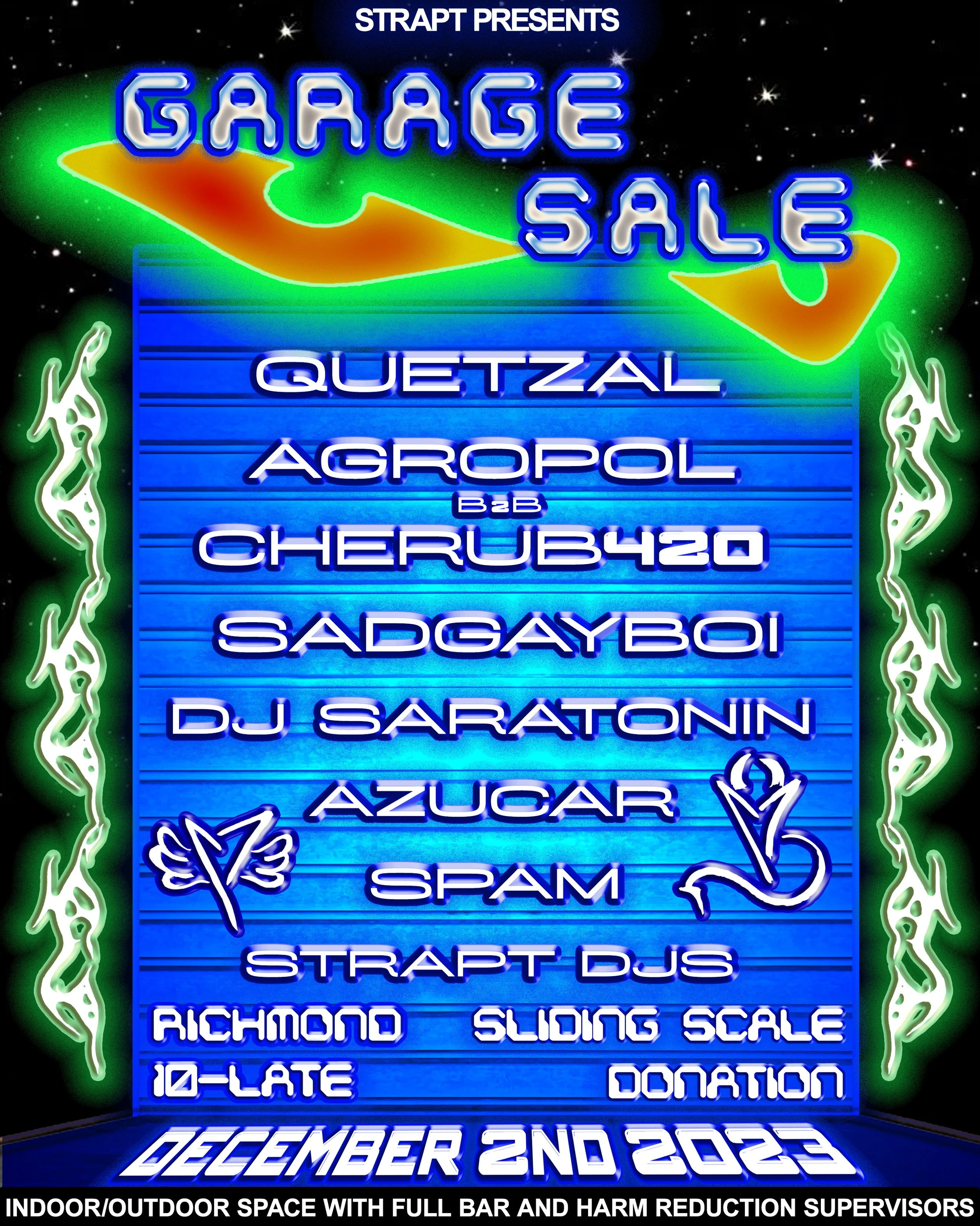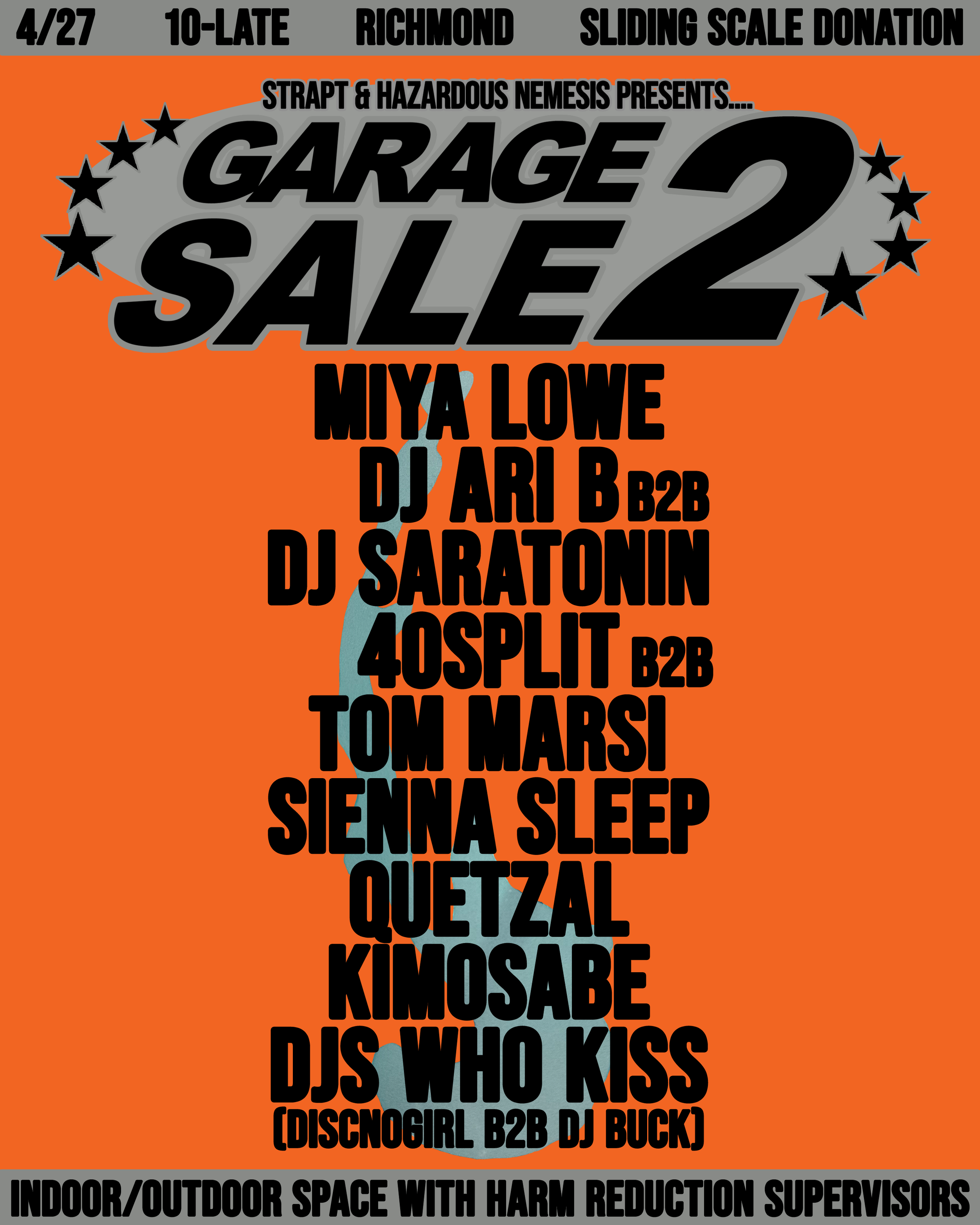
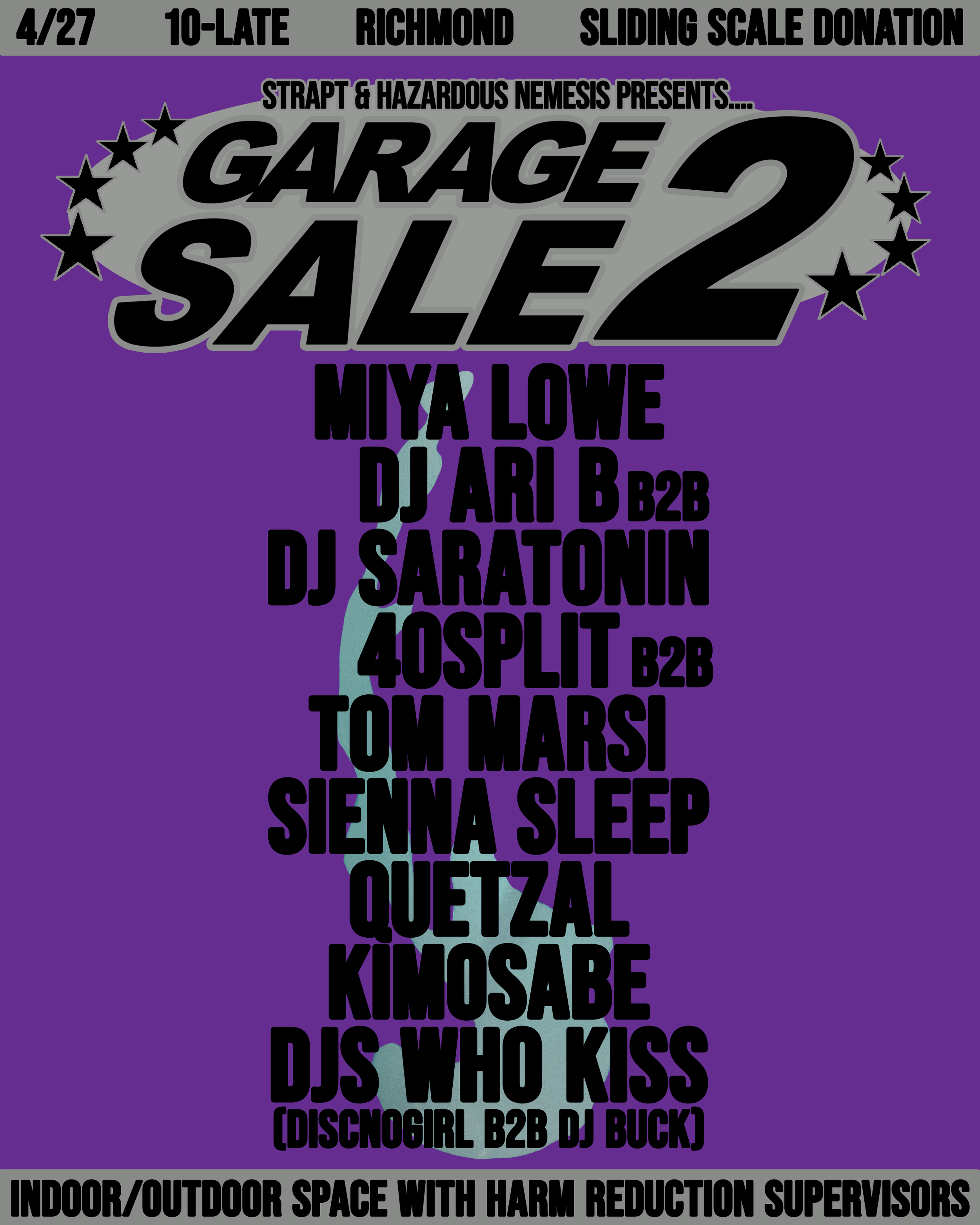

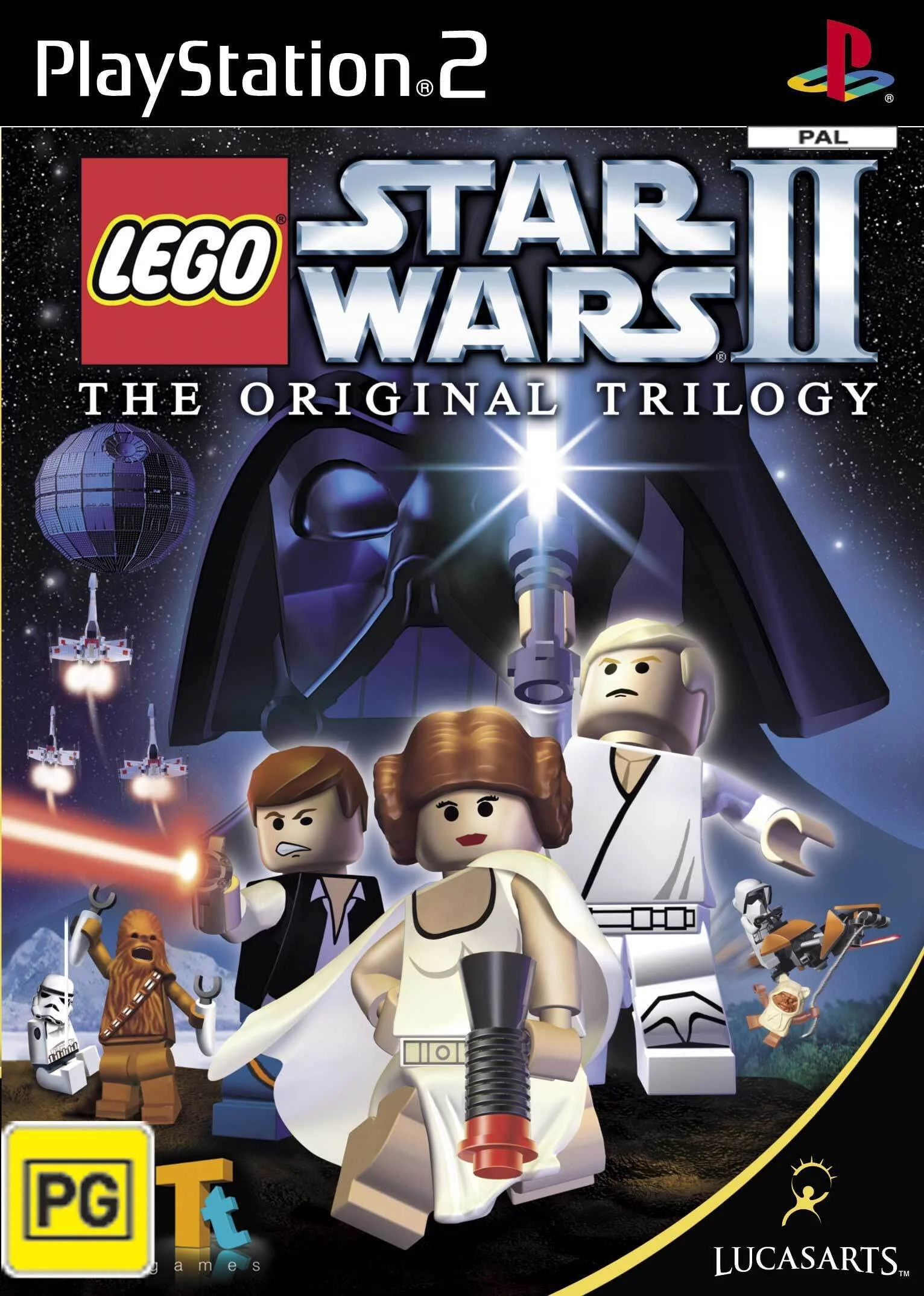
My last flyer for this party series (pictured below) was very dark and relied on two dimensional shading, so I wanted to refine & simplify this time around. In this design I chose very stark lettering and simple color schemes. Masked and changed the hues of soap water (Pictured above) & put it behind the names.This design choice silently brings cohesion to the piece, complimenting each color variant while separating the artist names and event title. When formatting the event title i borrowed design choices from early 2000’s video game media (Pictured on the right), mimicing the title formatting.