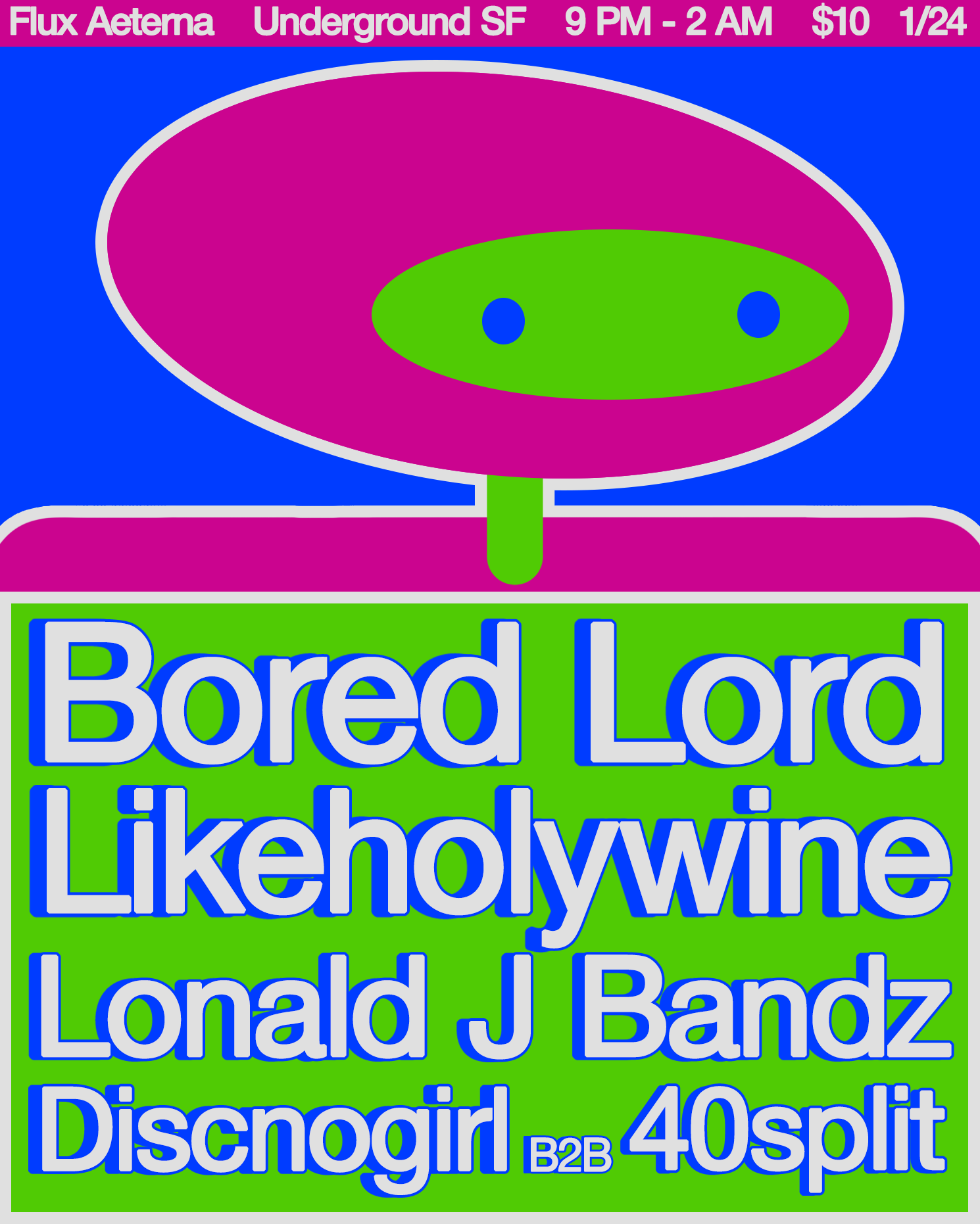
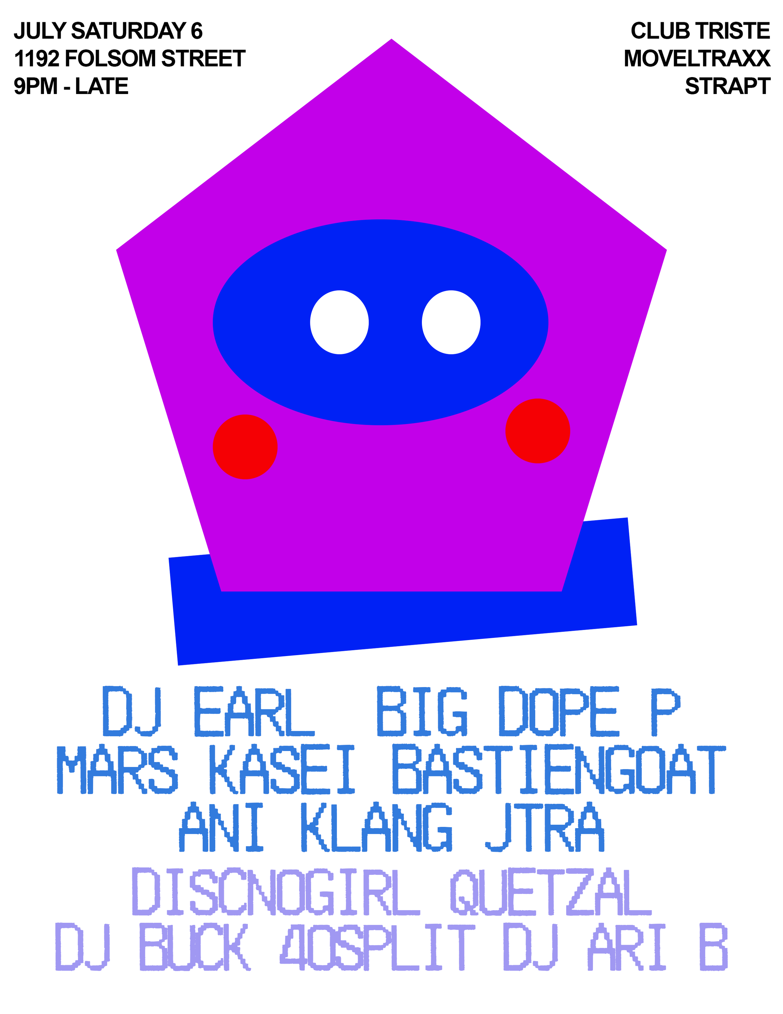
While outsourcing inspiration for this flyer, I reminisced on my strategies for producing new designs, what stuck and what didn’t. I thought back to a flyer I created for Strapt the year before (Pictured above). For that flyer, I started by drawing a face, taking a picture of it, putting it to photoshop, then recreating it by tracing over it—only using stock shapes. Since that character was so bright & colorful, I decided to keep the rest of the flyer simple, in order to make the character the focal point of the design. I wanted to flip this idea on its head with the following design (Pictured to the left), by creating a character in the same method but instead producing a vibrant color scheme for the rest of the flyer as well. I played with the dimensions of this charcter, making it look as though the characters head is at an angle, looking to the right. As well as that, I used a light grey outline to accentuate the bright colors.